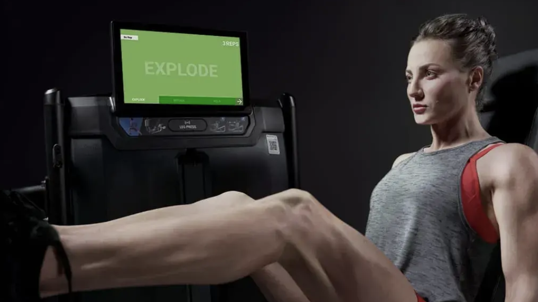
Intelligent Training Console
Designing the first on-screen workout experience for Matrix strength equipment.
PLATFORMS
Embedded Strength-Training Console
TOOLS
Wireframing · Interactive Prototyping
FOCUS
Research · Interaction Design · Prototyping · UX and UI Design · Usability Testing & Field Observation
ROLE
UX/UI Designer
The Challenge
Bringing a connected digital workout experience to strength training.
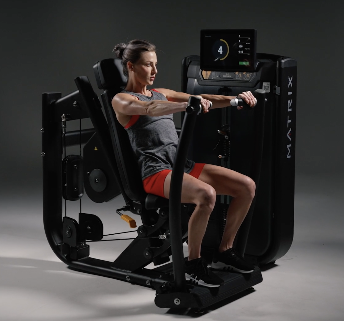
Matrix wanted to extend its on-screen workout experience from cardio equipment to strength machines such as leg presses and bicep curls. The console needed to teach users how to operate the equipment, guide new users through a fitness assessment, deliver personalized multi-week workout programs, track progress, and connect with Matrix’s Personal Trainer Portal.
Unlike cardio equipment, users would often need to read the screen while actively performing an exercise and maintaining proper form. That made visibility, glanceability, and the relationship between the interface and physical equipment especially important.
My Approach
Simulate
Create an early console simulation before final hardware was available so interface and hardware decisions could be evaluated together.
Test
Evaluate graphic size, contrast, visibility, and interaction with users in realistic strength-training conditions.
Refine
Translate testing feedback into wireframes, interactive prototypes, and updated UI for the selected hardware.
Observe
Watch people use the implemented equipment in a real gym environment and turn behavioral findings into recommendations for future updates.
Research & Discovery
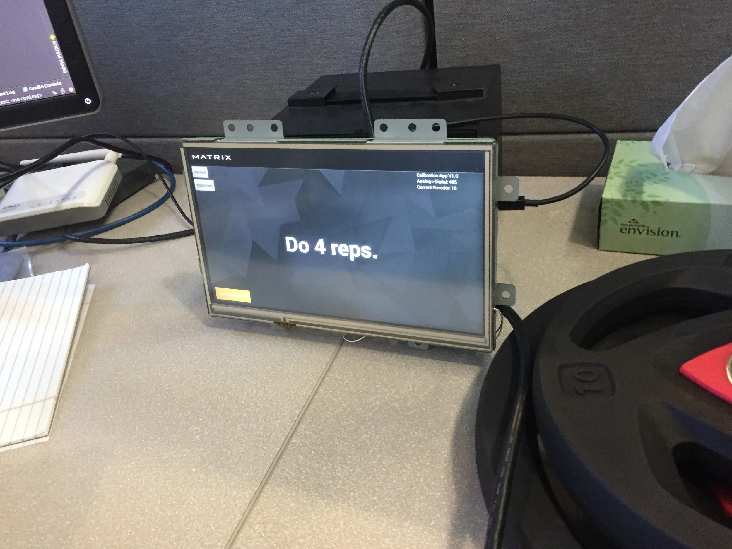
Testing the experience before the hardware existed.
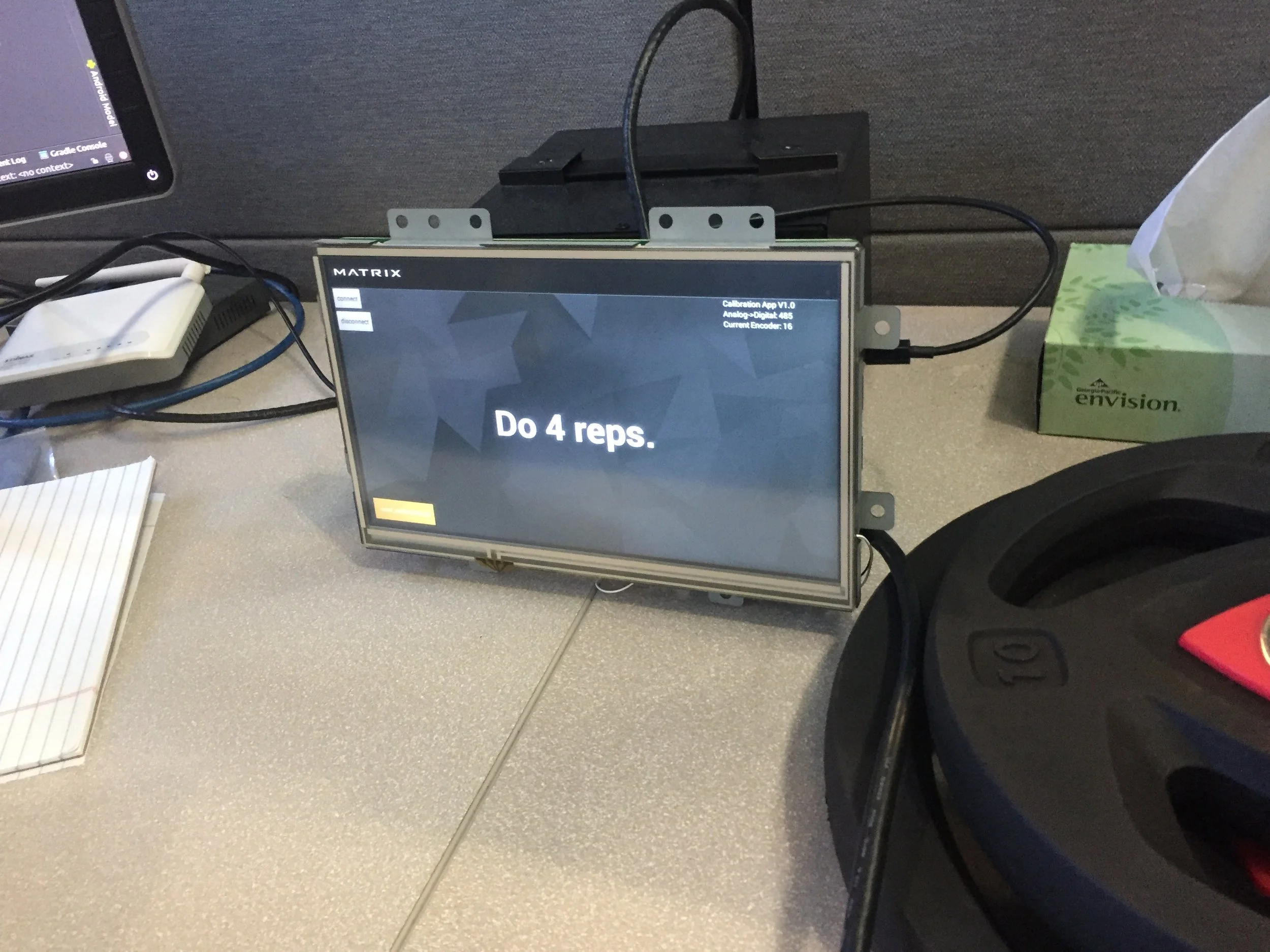
Rather than waiting for final hardware, I ran usability testing sessions using basic interface graphics on an iPad placed inside a 3D-printed housing to simulate the console experience.
This allowed us to evaluate the digital experience in context while the physical product was still being developed. The testing helped inform hardware decisions as well as the size and color combinations of graphics displayed on screen.
Design Decisions
Designing for Quick Glances
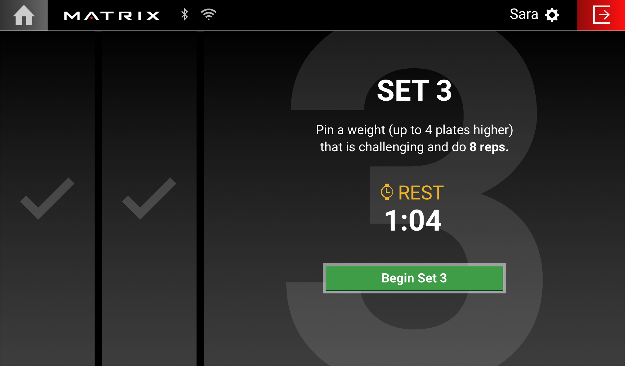
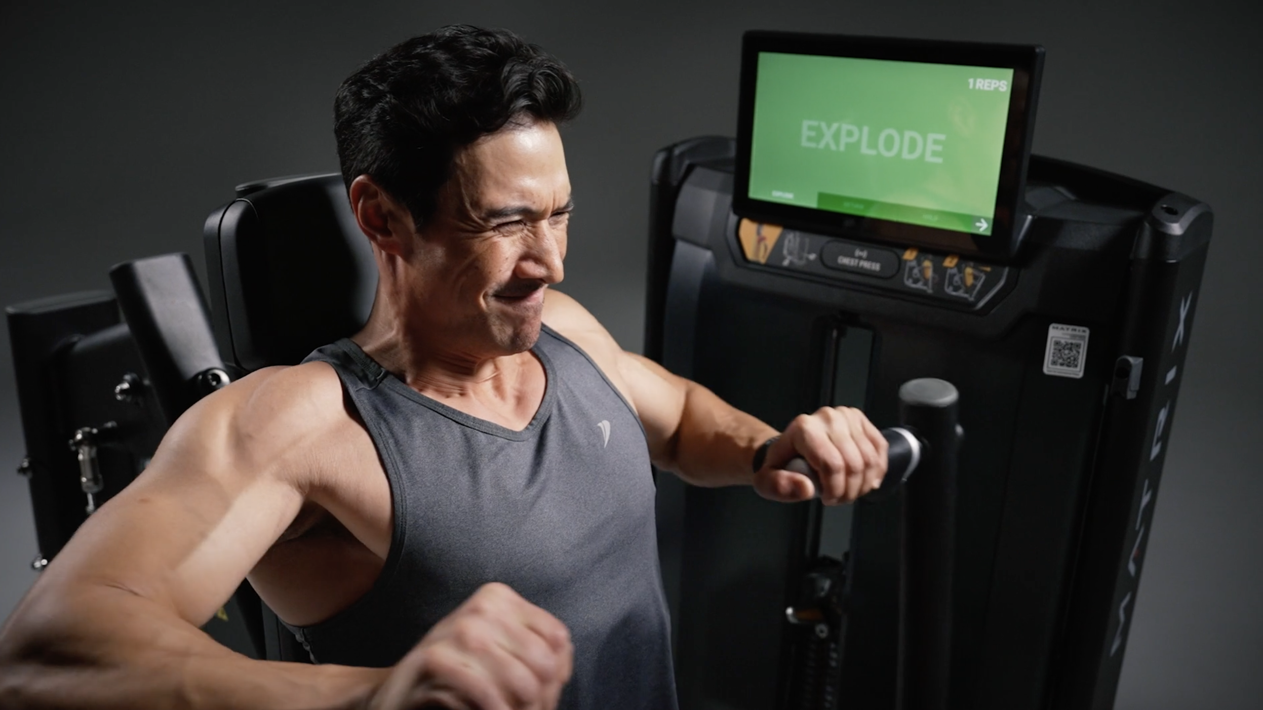
Strength training created a different interaction environment than a traditional touchscreen product. Users needed to monitor information such as time and repetitions while maintaining proper form, often viewing the display from different positions and angles.
Testing showed that large graphics with strong color contrast made this information easier to see in peripheral vision and across varying viewing angles and lighting conditions. The interface was refined around that behavior, prioritizing the information users needed most during an active exercise.
Designing for How Strength Users Actually Work Out
After implementation, I observed people using the equipment at a YMCA test installation. A clear behavioral difference emerged between cardio and strength users. Cardio users were more likely to spend time setting up a workout, exploring programs, and using entertainment options because they typically remained on one machine for a longer period.
Strength users often spent less than ten minutes at an individual machine and were more likely to begin exercising immediately rather than logging in or setting up a tracked program.
That observation led us to create a Quick Start mode focused on the essentials: time, sets, and repetitions.
Prototyping, Iteration, and Delivery
Moving from a simulated console to the final hardware.
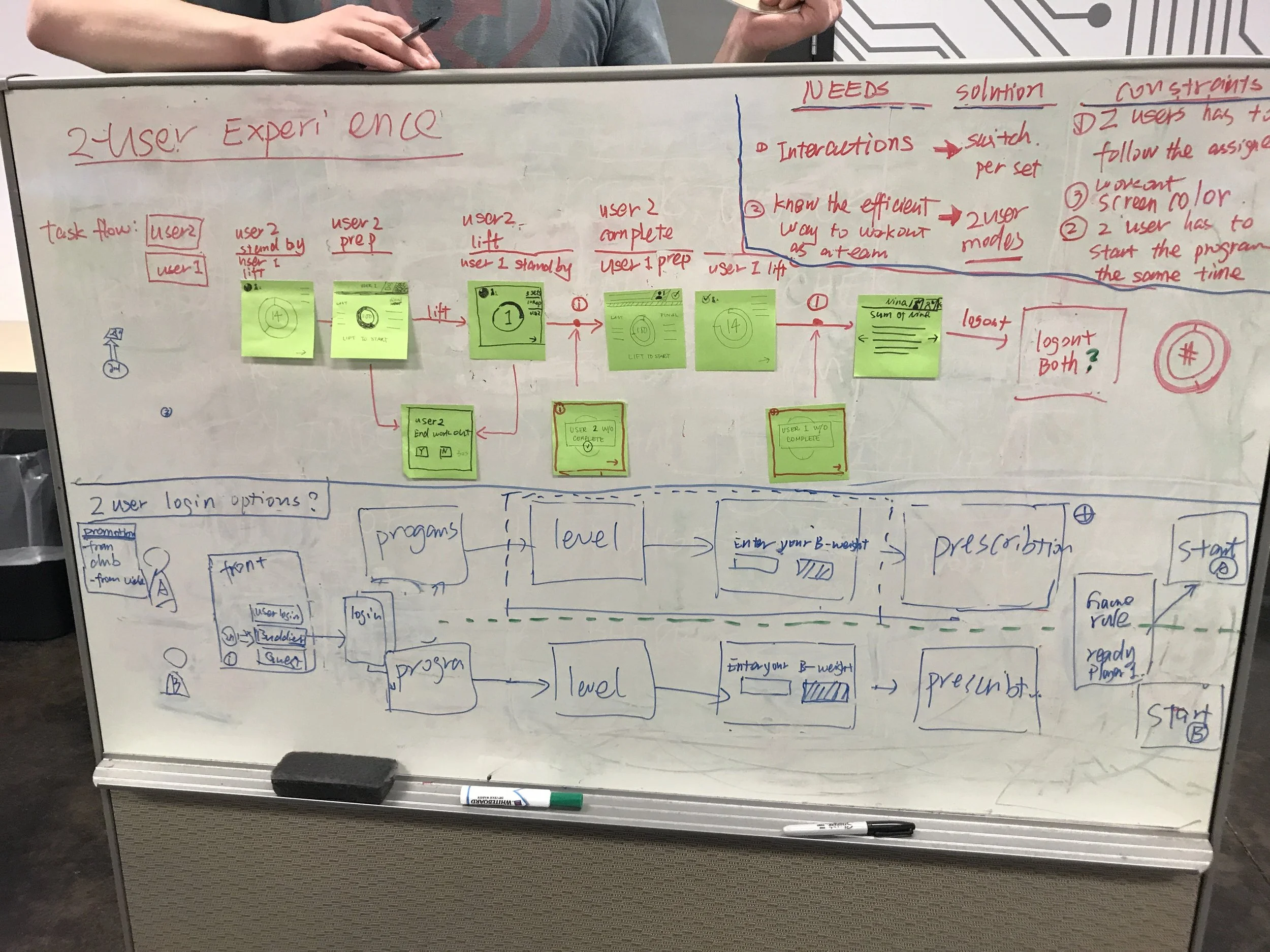
After the initial usability testing, I wireframed and designed the interface for clickable InVision prototypes. A second round of testing was conducted using the selected hardware, allowing the experience to be evaluated more realistically before development.
I refined the UI based on user feedback and collaborated with the development team on updates as the product moved toward implementation.
The Final Experience
A strength-training interface designed around the user’s physical environment.
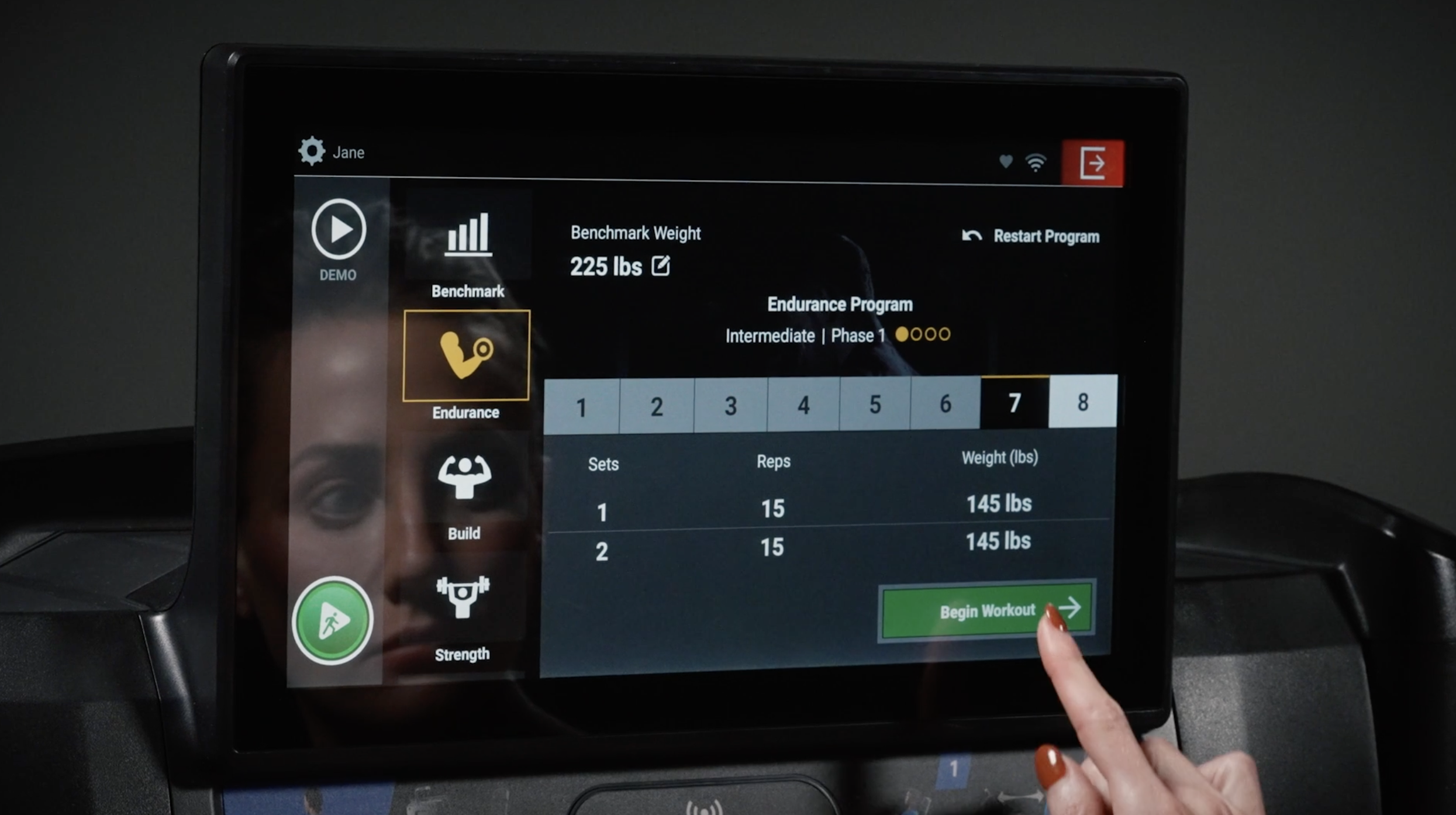
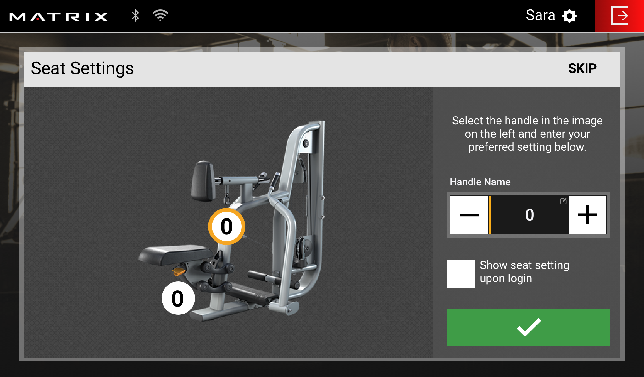
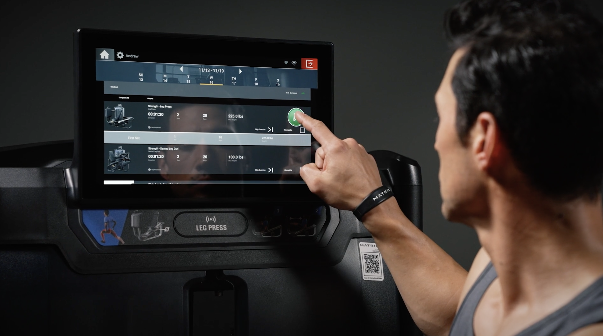
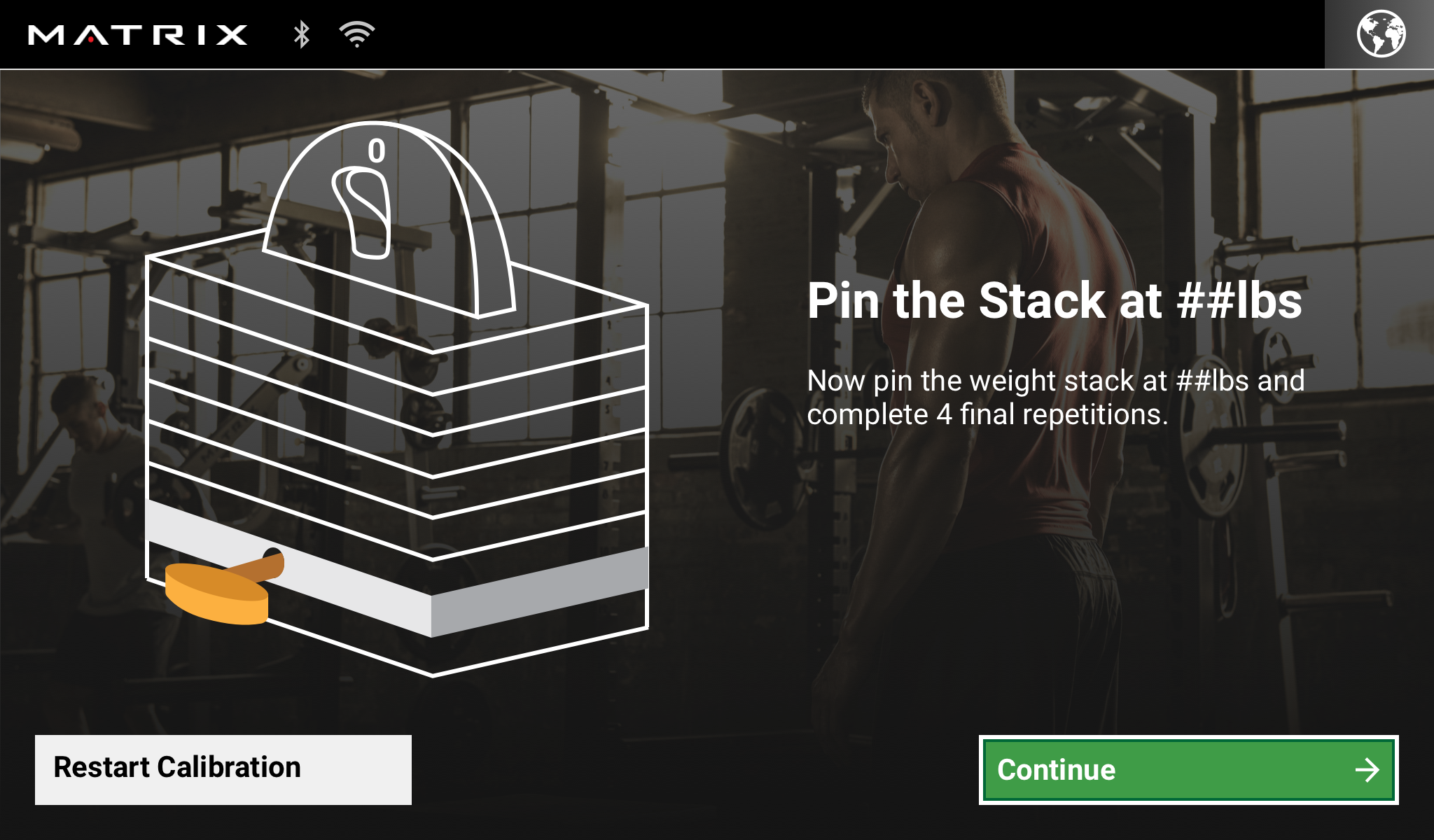
The final console helped users understand how to use the equipment, follow personalized workout programs, complete fitness assessments, track progress, and interact with Matrix’s connected personal-training experience.
At the same time, the interface accounted for the realities of strength training: users are moving, maintaining form, viewing the screen from different angles, and often spending only a short amount of time at each machine.
Outcome & Reflection
The console extended Matrix’s connected workout experience from cardio into strength equipment and created a new digital touchpoint within the broader fitness ecosystem. Field observation after implementation also identified an opportunity to better serve strength users, leading to the addition of a simplified Quick Start mode centered on time, sets, and repetitions.
The right experience isn’t always the one with the most functionality. Observing users in the environment where the product was actually being used revealed behaviors that were difficult to predict during initial design. In this case, simplifying the experience for strength users made the product better aligned with the way they actually worked out.
This project reinforced the importance of prototyping early, testing in context, and continuing to observe user behavior after a product reaches the field.