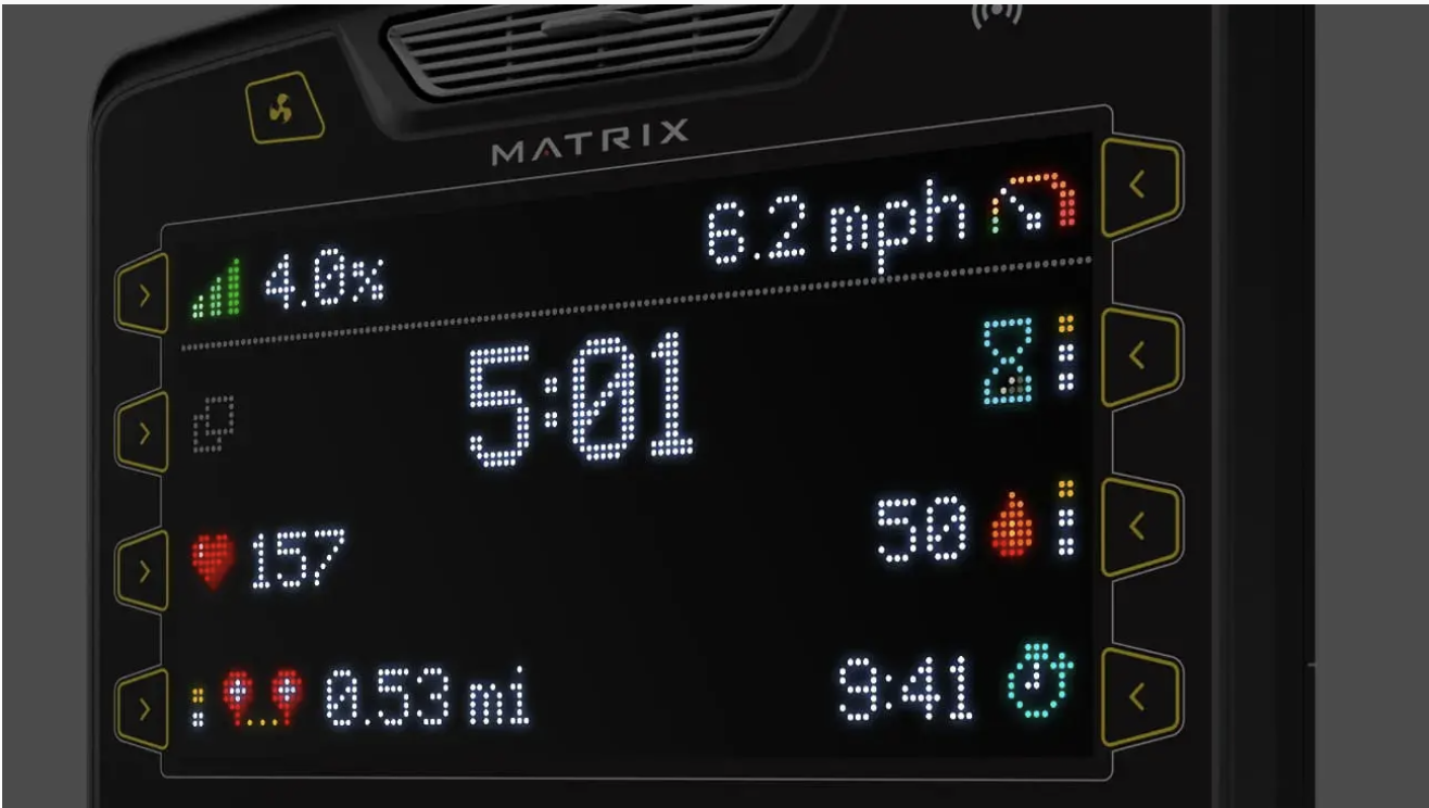
Premium LED Console
Designing an intuitive workout experience within the constraints of an 8,000-pixel LED display and physical controls.
PLATFORMS
LED Console · Physical Controls · Connected Fitness Equipment
IMPLEMENTATION
Planet Fitness facilities nationwide
FOCUS
Interaction Design · Prototyping · Usability Testing · Embedded UI · Localization · Developer Handoff
ROLE
UX/UI Designer
The Challenge
Creating a modern digital experience with only 8,000 pixels.
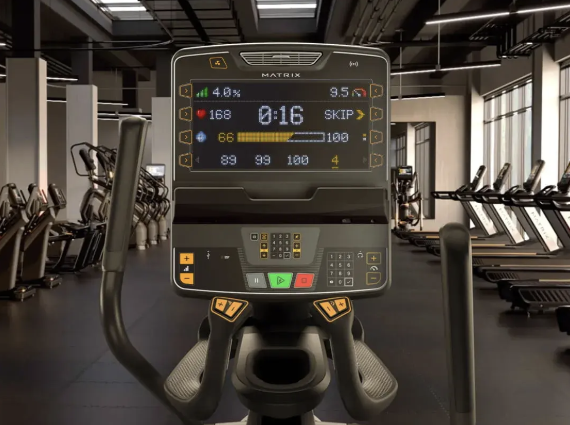
The Premium LED Console needed to deliver the clarity and usability people expect from a modern fitness interface using a dramatically more limited display and physical controls.
The experience also had to support more than workouts. Installation, setup, maintenance, troubleshooting, and usage reporting all needed to function within the same hardware constraints.
With limited resolution, no traditional touchscreen interaction, and support for multiple languages, every icon, animation, transition, and interaction needed to communicate efficiently.
The Approach
Research
Study LED interfaces and other limited-display systems to understand how movement, typography, icons, and graphics could communicate with minimal visual information.
Prototype
Explore the interface through digital prototypes, then adjust the testing method when touchscreen interaction failed to accurately represent physical controls.
Test
Evaluate button behavior, timing, animation, transitions, legibility, and comprehension with users.
Document & Deliver
Translate the final experience into clickable prototypes and detailed annotated flows for development.
Research & Discovery
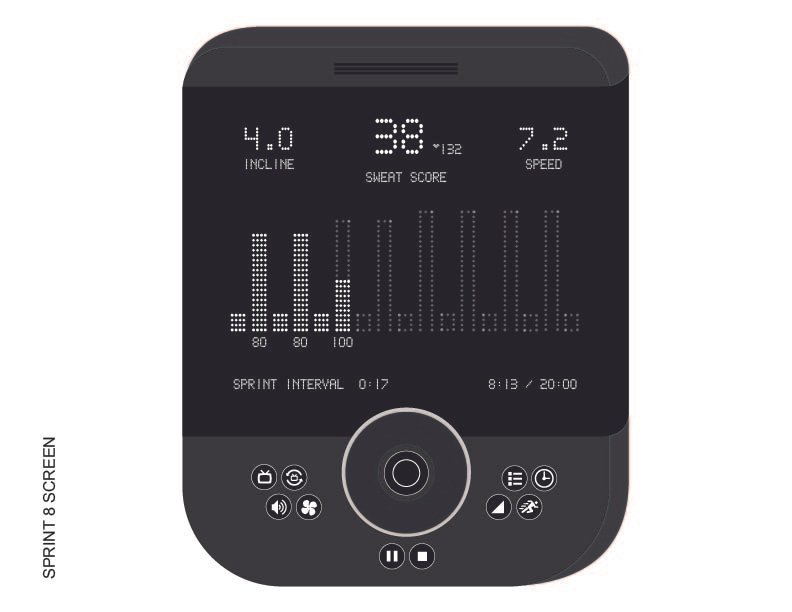
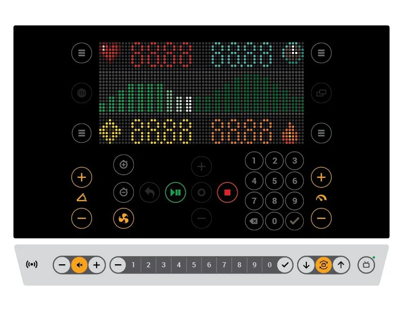
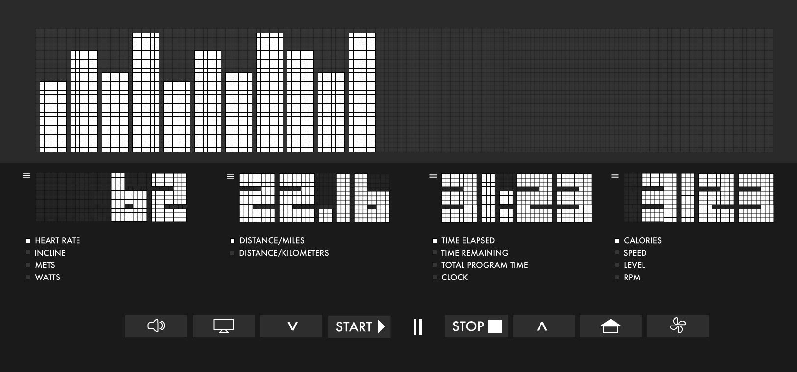
Designing for a very different kind of screen.
I began by researching LED interfaces and other limited-display systems to understand how they communicated information with far fewer pixels than a traditional screen.
That exploration helped establish how typography, icons, graphics, movement, and animation could work together when visual detail was limited.
The hardware constraints made hierarchy especially important. Every element needed a clear purpose because there was little room for unnecessary information.
Design Decisions
Choosing the Right Prototype for the Interaction
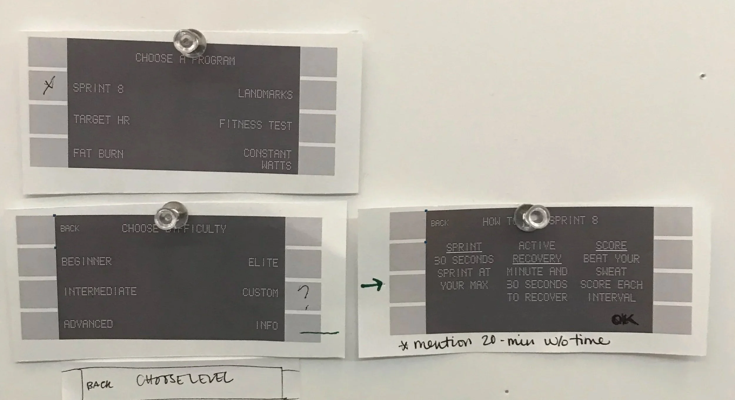
Early concepts were tested using touchscreen prototypes, but the testing revealed a problem: tapping a touchscreen did not accurately simulate repeatedly pressing physical buttons.
The prototype itself was changing how users behaved. I shifted to paper prototyping to better represent the physical interaction. This made it easier to observe how users navigated the interface using discrete button presses and helped inform the placement and behavior of the physical controls.
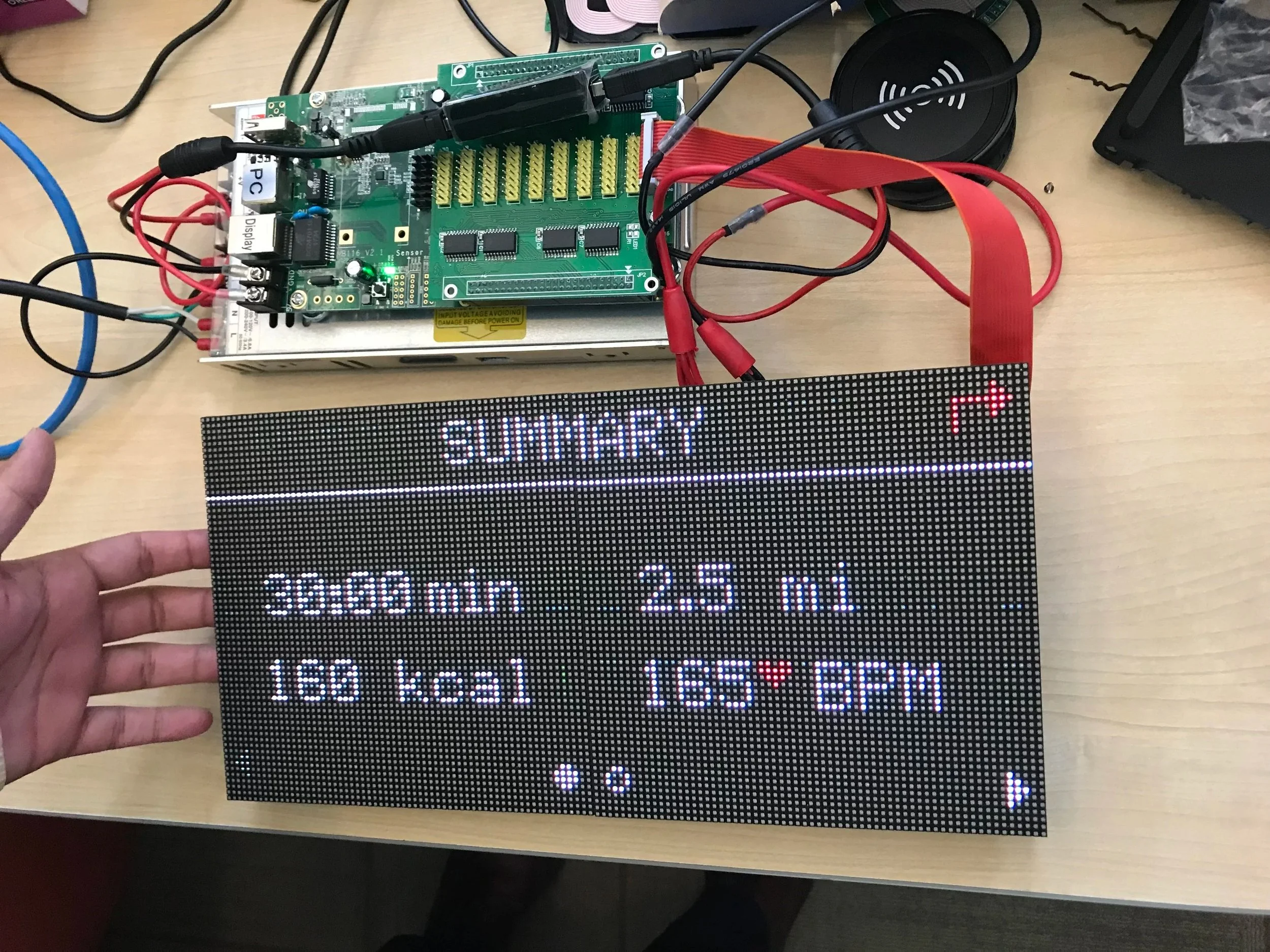
Communicating with Limited Resolution
With approximately 8,000 pixels available, conventional interface patterns could not simply be scaled down.
I tested timing, animation, transitions, typography, icons, and graphics to determine how effectively information could be understood within the display’s limitations.
Motion and timing became part of the information architecture. Instead of relying on visual detail alone, the interface could use changes over time to help communicate states and actions.
Designing Across Languages
The console needed to communicate across multiple languages, adding another constraint to an already limited display. That made concise language, recognizable iconography, and visual clarity especially important.
The interface needed to remain understandable as labels and instructions changed between languages without relying on layouts that only worked for one set of words.
Prototyping, Testing & Delivery
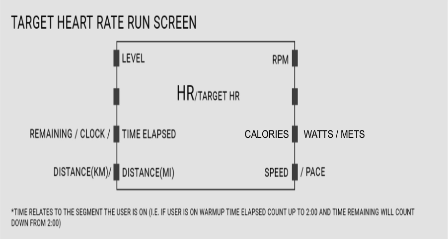
Turning interaction decisions into implementation-ready documentation. As the experience developed, I created high-fidelity clickable prototypes alongside detailed, annotated UX/UI flows.
These materials documented interface behavior, transitions, states, and interactions for the development team in Asia, helping translate a highly constrained interaction system from design into implementation.
The process required thinking beyond individual screens and documenting how the interface behaved over time as users navigated with physical controls.
The Final Experience
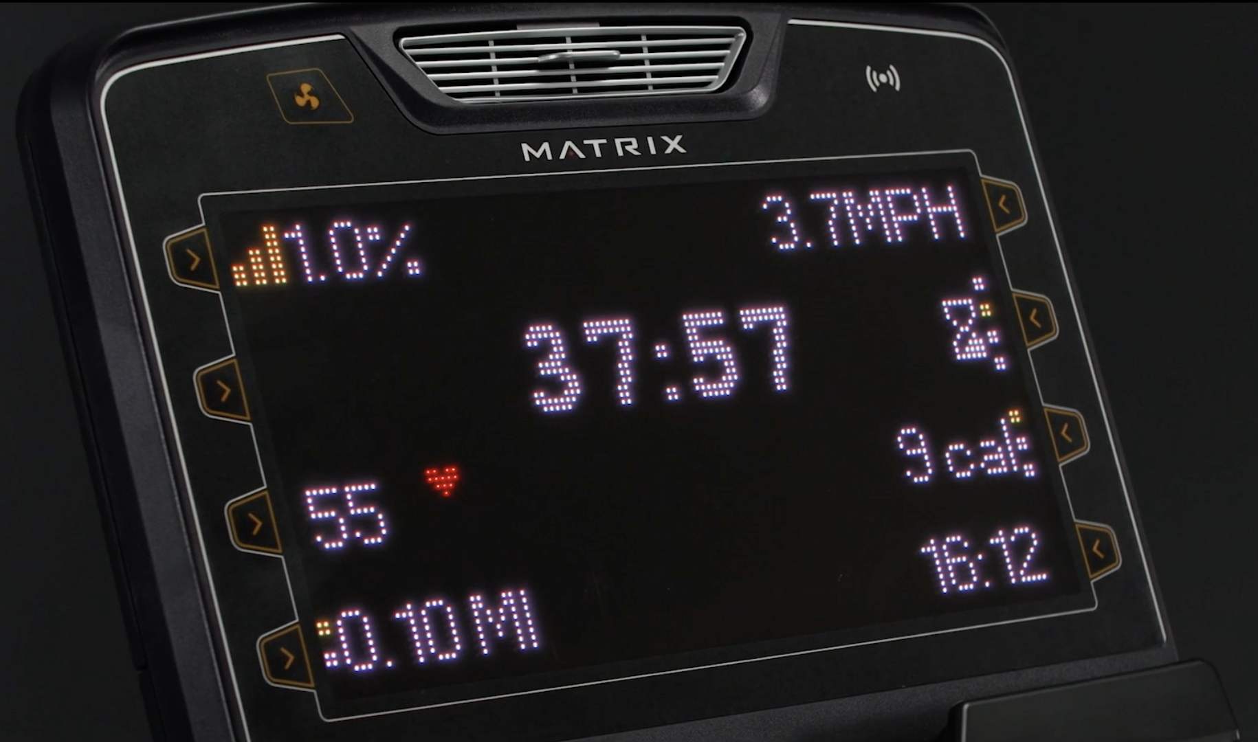
A complete equipment experience built within an intentionally limited interface.
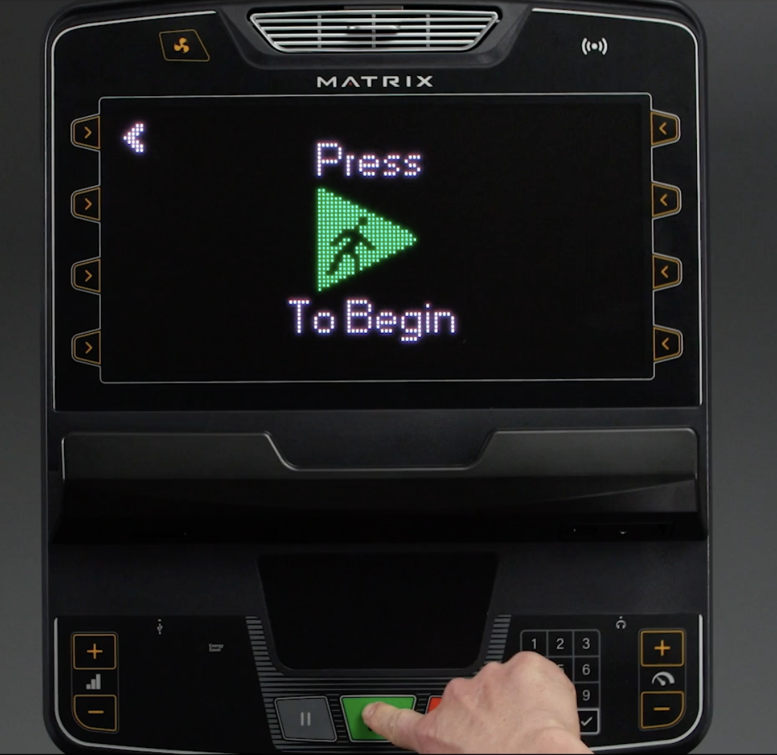
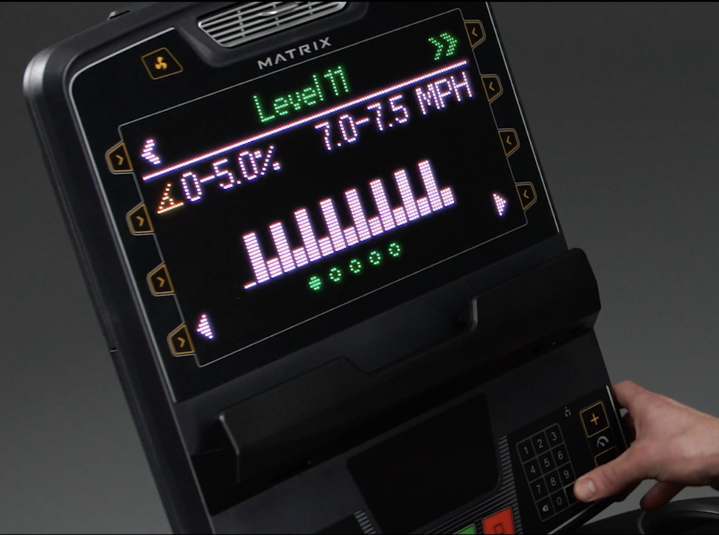
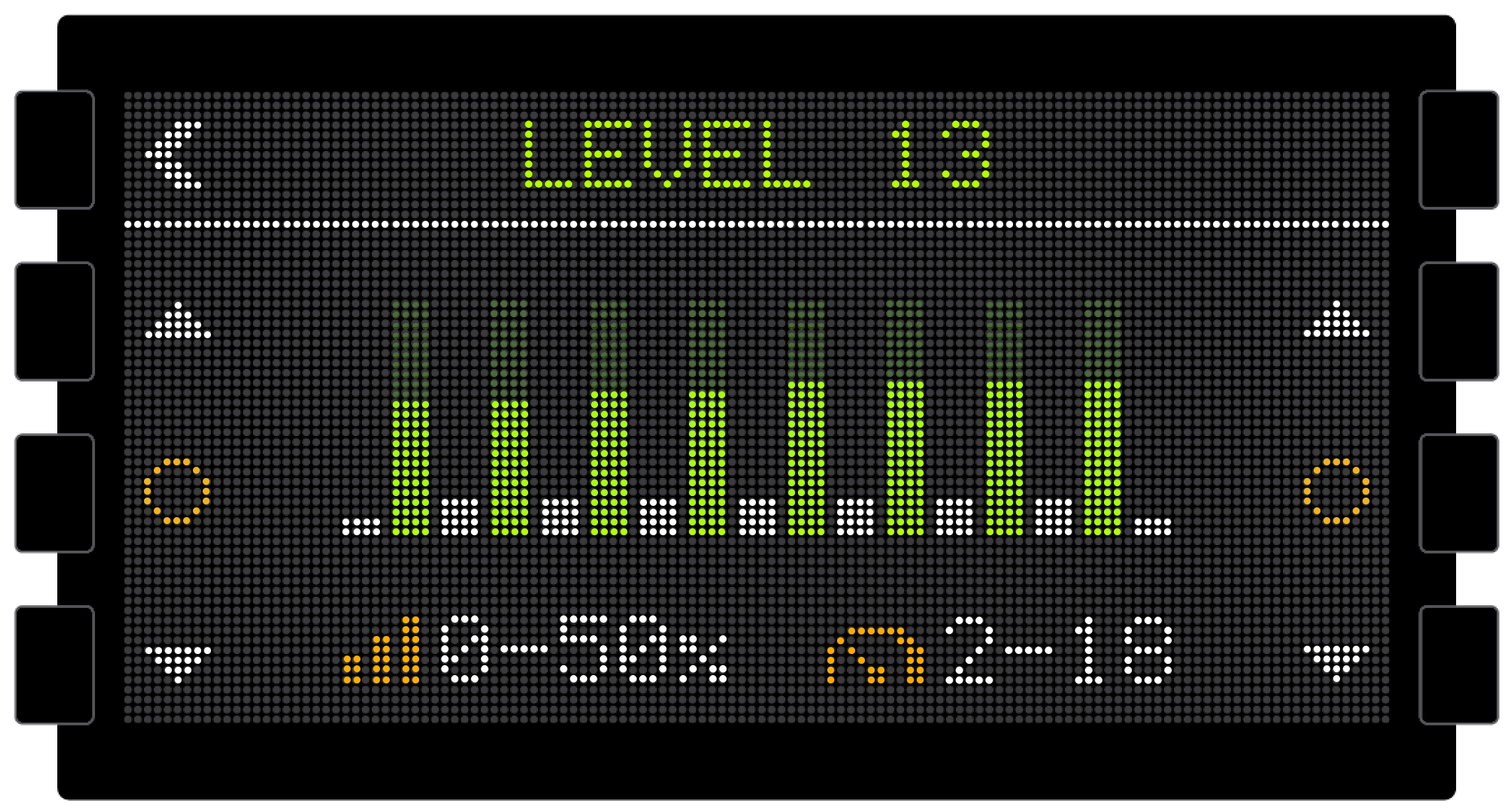
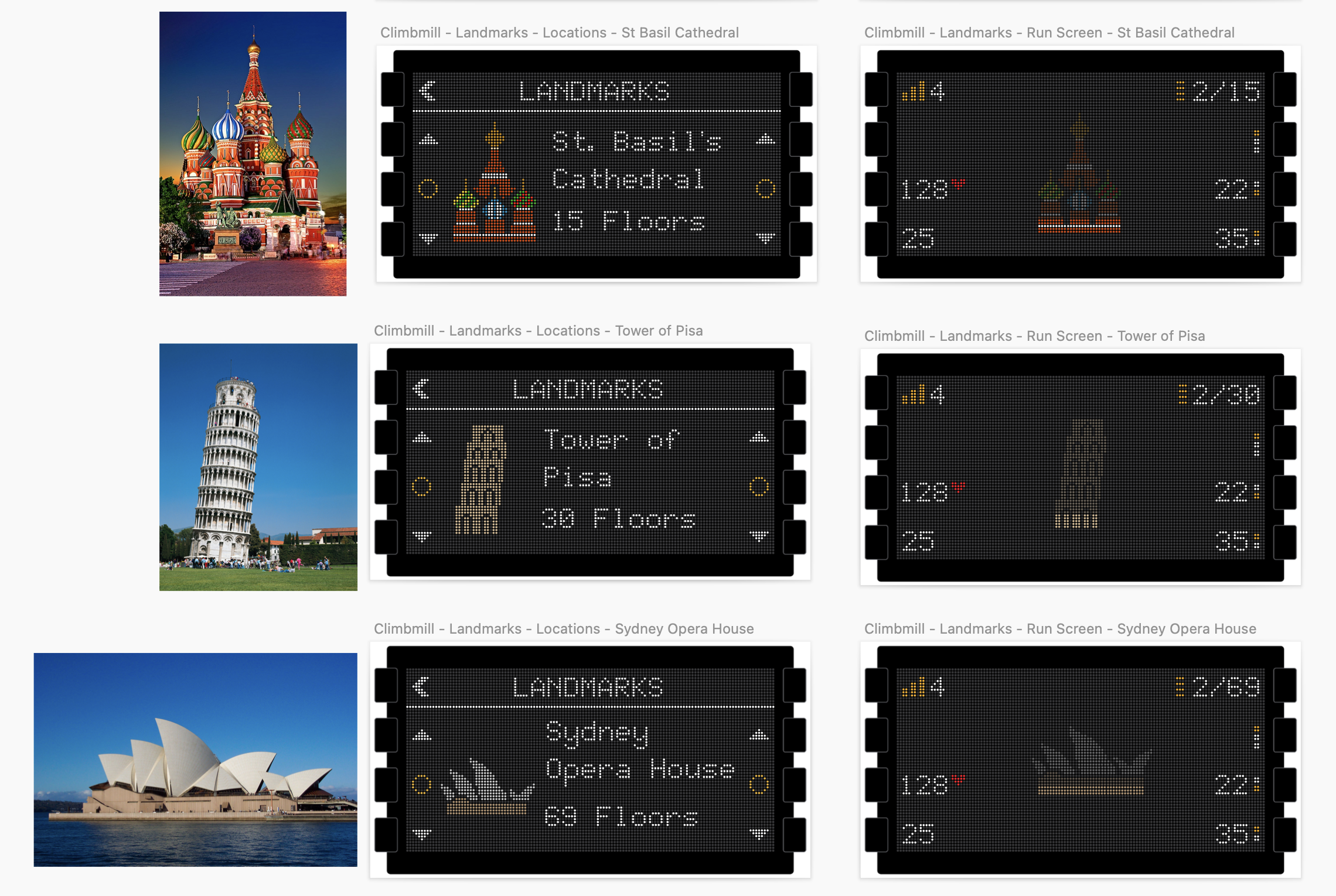
The final console supported workout experiences alongside installation, setup, maintenance, troubleshooting, and usage reporting—all within the same LED display and physical-control system.
Rather than treating the limited hardware as a reason to simplify the product itself, the interface used hierarchy, iconography, motion, timing, and carefully defined interactions to make a broad set of functions understandable.
Outcome & Reflection
The Premium LED Console moved from research and prototyping into a production experience that has been deployed on Matrix fitness equipment in Planet Fitness locations across the United States.
The final interface translates workout, equipment setup, maintenance, troubleshooting, and usage-reporting functions into a system designed specifically around the constraints of LED hardware and physical controls.
I supported implementation with high-fidelity prototypes and detailed UX/UI documentation for the development team.